[Blog] What is the ROC curve for solving machine learning classification problems?
How to evaluate model performance in classification problems is an important issue. Among them, the ROC curve is widely used as one evaluation indicator. This article provides an easy-to-understand understanding of ROC curves and details the origin and meaning of ROC curves.
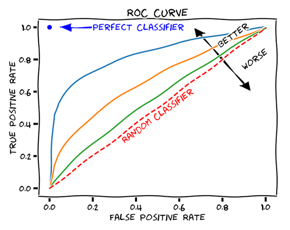
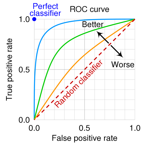
The ROC curve in classification problems is an important tool for evaluating model performance in machine learning and data science. The ROC (Receiver Operating Characteristic) curve is a graph that visualizes the relationship between the true positive rate (TPR) and false positive rate (FPR) of a classification model.
First, let me explain the origin of the ROC curve. It was originally used to evaluate the performance of radar technology during World War II, and was later applied to fields such as medicine and testing. And now it is widely used to evaluate classification problems in machine learning.

The concepts of true positive rate (TPR) and false positive rate (FPR) are important to understanding ROC curves. The true positive rate represents the percentage of actually positive data that are predicted as positive. The false positive rate, on the other hand, represents the percentage of incorrectly predicted positives for data that are actually negative. These values are used as indicators to evaluate the performance of the classification model.
The ROC curve is drawn with the true positive rate (TPR) on the horizontal axis and the false positive rate (FPR) on the vertical axis. The shape of the curve represents the performance of the model, with the upper left corner of the curve indicating a model with superior performance. The area under the ROC curve (AUC) is used as an overall measure of the model's predictive performance; the closer the AUC is to 1, the better the model performs.
To illustrate the concept of the ROC curve, let us take a concrete example.
For example, consider a classification model for predicting the test result of a certain disease. A person who has a positive test result and actually has the disease is a true positive (True Positive), while a person who has a positive test result but is actually healthy is a false positive (False Positive).
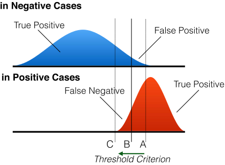
To evaluate the predictive performance of the model, classification criteria are set at various thresholds and the true positive rate (TPR) and false positive rate (FPR) are calculated. Higher thresholds result in fewer positive predictions and lower true positive rates (TPR), but also lower false positive rates (FPR). Conversely, a lower threshold value results in more positive predictions and a higher true positive rate (TPR), but also a higher false positive rate (FPR).
The ROC curve is a graph that represents this relationship between the true positive rate (TPR) and the false positive rate (FPR). Each point on the graph corresponds to a different threshold value, and the combination of true positive rate (TPR) and false positive rate (FPR) at all threshold values is plotted. These points are then connected to draw a curve.
The shape and position of the ROC curve indicates the predictive performance of the model. For example, the closer the ROC curve is to the upper left, the better the performance of the model. Also, the larger the area under the ROC curve (AUC), the better the performance of the model.
Observation of actual data and graphs is helpful in understanding the ROC curve; understanding the origin and significance of the ROC curve will help you understand how to evaluate models in classification problems.